


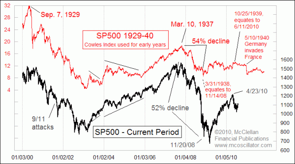
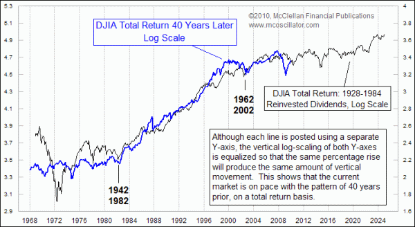
- Goodbye July! The first three charts show how these wide swings have made it tough for both sides.
- We're stuck in the middle of this big sideways area. Literally, could go either way.
- Final 2 charts just show some unusual similarities (analogs) between current and past timeframes. Correlations don't last...it's just interesting when they occur.





No comments:
Post a Comment